The Customisation dashboard lets you configure the visual aspects of the checkout page—including your logo, brand colours, button styles, and typography—to maintain a consistent appearance with your platform and ensure visual continuity between your site and the payment page.
The Customisation page includes two tabs:
- Visual Customisation. Controls the appearance of the checkout page, including branding, layout, and UI components.
- Business Customisation. Controls business-level payment gateway settings, such as payment methods, ordering, and related behaviour.
This topic describes Visual Customisation only.
Access the visual customisation page
To access and edit the checkout appearance:
- Log in to the Merchant Dashboard with your credentials.
- Go to Payments > One Click Checkout > Settings > Customisation.
- Select the Visual Customisation tab.
- Do one of the following:
- For a quick setup, use the Basic options.
- For detailed control over individual UI components, turn on Advanced Customisation.
- In the Preview panel on the right, verify how the checkout page appears to customers.
- Select Save to apply your changes.
The Preview panel updates in real time as you change settings, so you can confirm the appearance of the checkout page before you save.
Configuration options
Select a tab to view the configuration options available for each mode.
Basic configuration applies minimal branding quickly. The following options are available when Advanced Customisation is off.
-
Logo: Enter your brand logo URL in the Logo field. The logo appears in the checkout header. To remove the logo, select the × icon next to the URL.
-
Primary brand colour: Enter a hex colour code for your primary brand colour. This colour applies to the header and primary action buttons across the checkout page. To restore the default, select the reset control next to the colour field.

Turn on Advanced Customisation for granular control. The left navigation includes Layout and Typography, Header, and Buttons.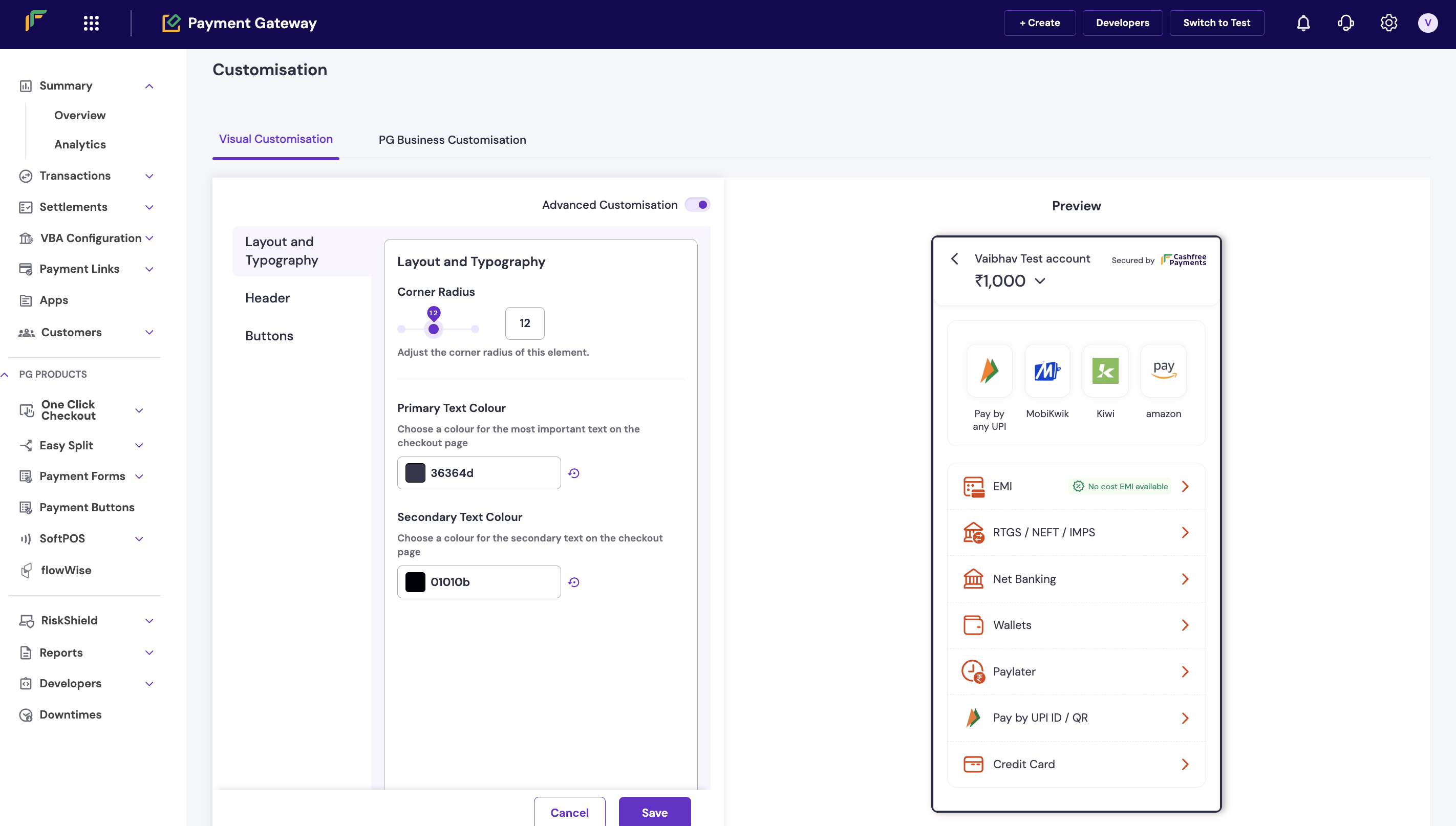
Layout and typography
Use this section to control the overall structure and text styling of the checkout page.
-
Corner radius: Use the slider or numeric field to set the corner radius for applicable UI elements. A value of
0 produces square corners; higher values increase rounding.
-
Primary text colour: Enter a hex code for the most prominent text on the checkout page, such as headings and key labels.
If the colour you choose does not meet contrast requirements against the checkout background or card colours, the dashboard displays an inline warning. Adjust the colour to keep text easy to read.
- Secondary text colour: Enter a hex code for supporting text, such as descriptions and secondary labels.
The dashboard checks secondary text for contrast as well. If a warning appears, change the colour to improve readability.
-
Logo: Enter the URL of your brand logo. This is the same Logo field as in basic configuration. To remove the logo, select the × icon.
-
Header colour: Enter a hex code for the header background. Select the reset control to return to the default.
-
Header text colour: Enter a hex code for text displayed in the header.
If the header text and header background colours do not meet contrast standards, the dashboard displays an inline warning. Adjust one or both colours until the warning clears.
-
Brand display: Choose how your brand appears in the header:
- Show Both Logo and Name: Displays both the logo image and the brand name.
- Show Logo Only: Displays only the logo image.
- Show Name Only: Displays only the brand name as text.
Buttons let customers perform actions on the checkout page. There are three button types, listed in order of emphasis.Primary buttons use a solid fill and represent the most important actions, such as completing a payment.
- Active primary button: Active buttons are selectable by the customer and can inherit your primary brand colour.
- Button colour: Background colour of the active primary button.
- Text colour: Label colour of the active primary button.
If the label and background colours fail contrast checks, the dashboard displays an inline warning. Adjust the colours to keep the label readable.
- Disabled primary button: Disabled buttons are visible but unavailable while an action cannot be performed.
- Button colour: Background colour of the disabled primary button.
- Text colour: Label colour of the disabled primary button.
Secondary buttons are outlined and represent the next most important actions.
-
Active secondary button
- Text colour: Label colour of the active secondary button.
- Border colour: Outline colour of the active secondary button.
If the text colour fails contrast checks against the checkout page background, the dashboard displays an inline warning. Adjust the colour as needed.
-
Disabled secondary button
- Text colour: Label colour of the disabled secondary button.
- Border colour: Outline colour of the disabled secondary button.
Tertiary buttons are text only, with no fill or border, and are used for lower-emphasis actions.
-
Active tertiary button: Active tertiary buttons are selectable and can inherit the primary brand colour.
- Text colour: Label colour of the active tertiary button.
-
Disabled tertiary button: Disabled tertiary buttons are visible but unavailable while an action cannot be performed.
- Text colour: Label colour of the disabled tertiary button.
Turn on Button Shadow to add a drop shadow to buttons. Enter a hex colour code for the shadow to add depth to button elements on the checkout page. 